Stop Making Posters Nobody Remembers: A Case for the Great Indie One-Sheet
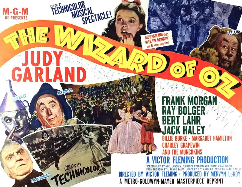
Photo: Metro-Goldwyn-Mayer (MGM)., Public domain, via Wikimedia Commons
I'm going to say something slightly mean, and I want you to hear it with love: most indie movie posters are forgettable, and most filmmakers made them forgettable on purpose. They defaulted. Defaulted to the floating head collage. Defaulted to the moody silhouette against a sunset. Defaulted to slapping a production still under the title in whatever font came with the software. The poster got done, which is not the same thing as the poster got made.
This matters more now than it ever has, and here's why.
Your Poster Is a Thumbnail Now
The one-sheet used to hang in a theater lobby, three feet tall, commanding a room. Today your poster's real life is as a thumbnail the size of a postage stamp, wedged between a true crime docuseries and a cooking competition on someone's TV. That's not a downgrade — it's a constraint, and constraints breed better design. A poster that works at 200 pixels has to be bold, simple, and conceptually sharp. A poster that only works at three feet tall was never really working at all.
Look at the DIY posters that have stuck around. The grainy, high-contrast one-sheets of early John Waters. The hand-painted horror VHS covers that looked like they were made in a garage because they were. The Criterion-style minimalism that indie designers adopted not as imitation but as a survival strategy — one strong image, one clear idea, done. None of these needed a marketing department. They needed a point of view.
What the Good Ones Have in Common
I talked to a few working designers who do poster art for small films, and their advice kept circling the same themes:
One idea, not five. A poster isn't a plot summary. The temptation to include every character, every location, and every review blurb is the same instinct that ruins first drafts. Cut until it hurts, then cut the font options down to one or two.
Contrast you can read on a phone. Design for the worst-case viewing scenario: tiny screen, bad lighting, distracted viewer. If the title isn't instantly legible at thumbnail size, start over.
A genre promise. The poster is a contract. Warm colors, handwritten type, and soft focus promise one kind of movie; harsh light and hard shadows promise another. If your poster promises a thriller and your film delivers a tender family drama, you haven't confused anyone — you've broken a promise to everyone.
Human imperfection. Ironically, in an era of AI-generated sludge, hand-drawn type, textured paper stock, and slightly off-kilter composition now read as more professional, not less. They signal a human made this, on purpose.
A Short List of Moves That Work
- Design around a single object from the film, not the cast
- Use negative space as the actual image
- Shoot a new photograph for the poster instead of pulling a still — you're making a second piece of art, not photocopying the first
- Test it at thumbnail size before you fall in love with it
- Let the type do acting: a title set in shaky handwriting says something a clean sans-serif can't
The Poster Is the Cheapest Marketing You'll Ever Do
Here's the part that should light a fire under every filmmaker reading this: you can reshoot a scene, but you can reshoot a poster in an afternoon. It's the highest-leverage piece of art on your entire project. It appears on the festival page, the crowdfunding campaign, the social feed, the press kit, and the streaming grid. It is your film's handshake, its first impression, and its business card all at once.
So give it a real budget line. Give it a real deadline — weeks, not the night before your festival submission. Give it the same creative energy you gave your best scene.
The films that fly are the ones that got noticed in the first place. And getting noticed starts with one image, one shot, one sheet that refuses to be scrolled past.